Mini specimen: Glassure
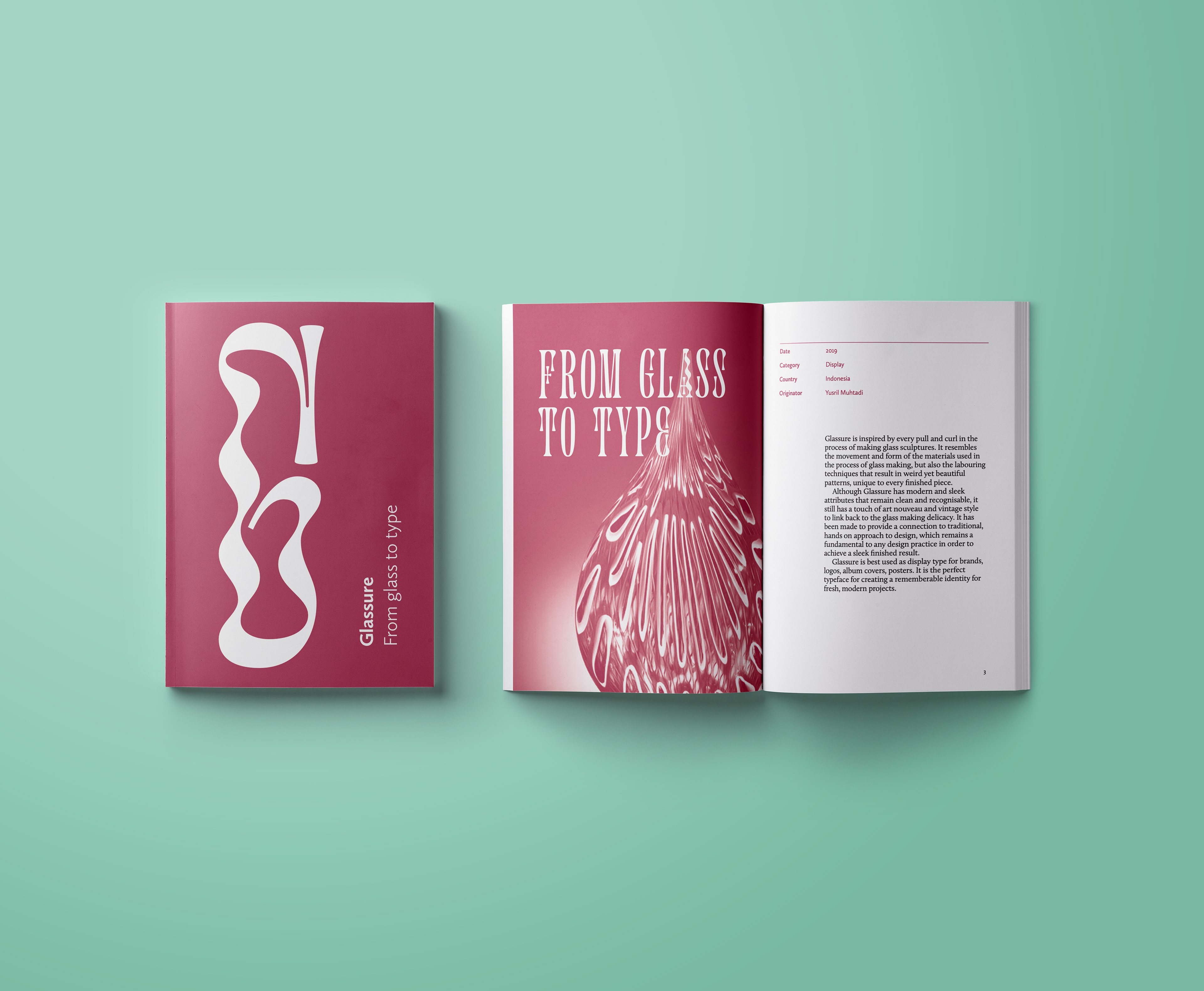
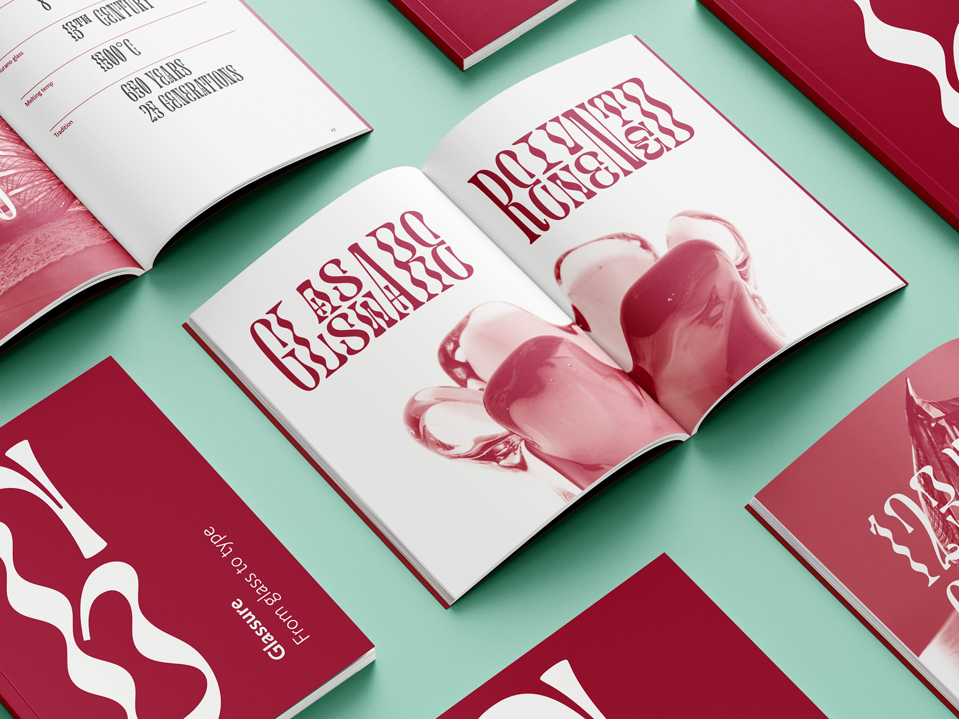
Glassure was inspired by the push and pull of Venetian glassmaking. The lower-case style reflects the moulding and shaping of glass through its wavy characteristics. The upper-case style results in a more legible, straight letterform, representing the delicacy in the final glass product. Even at smaller text sizes, Glassure remains legible through its half-size variations. These tilting alternatives enable dynamic design options, through stacking of letters to enhance project personality.
As technology develops, the world is generally moving over to an entirely digital world where things that were once delicacies are being moved into rapid factory production, diminishing the love, care, and precision in human craftsmanship. Glassure is a typeface helping to change the world as it provides a connection to traditional, hands on approach to design, which remains a fundamental to any design practice in order to achieve a sleek finished result. Through this reusable, digital form, people can continue to appreciate the movement and forms of traditional design through modern, sophisticated letterforms all over the world.
